Visual Aids Can Help People Better Understand Health Risks

In order to be able to make sound health decisions, patients need to understand the risks and the benefits that come with medical treatments, screenings, and lifestyle choices. But many people have difficulty understanding the numerical concepts that are essential for understanding risk-benefit information.
In a new article, researchers Rocio Garcia-Retamero of the Max Planck Institute for Human Development in Berlin and Edward Cokely of Michigan Technological University discuss the important role that visual aids can play in communicating health-related information. The article is published in the October 2013 issue of Current Directions in Psychological Science.
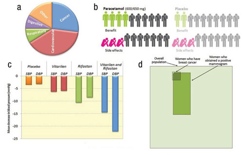
The researchers note that a visual aid can be any graphical representation of a probabilistic concept related to health, which can include pie charts, bar graphs, icon arrays, and other kinds of displays.
Studies have shown that people consider risk information easier to understand and recall when it’s presented using a visual aid. Furthermore, it typically takes people less time to understand information when it’s presented visually than when it’s presented numerically.
Research by Garcia-Retamero, Cokely, and others shows that well-designed visual aids can be particularly effective for vulnerable populations, such as older adults, high-risk patients, immigrant populations, and those who have poor numeracy skills and little medical knowledge.
“As long as vulnerable people have moderate levels of graph literacy, appropriate visual aids tend to dramatically improve comprehension and decision making,” they note.
But that doesn’t mean all visual aids are equally effective.
According to the researchers, “[v]isual aids tend to be most effective when they are transparent – when their elements are well defined and they accurately and clearly represent the relevant information by making part-to-whole relationships in the data visually available.”

Examples of transparent visual aids (adapted from Fig. 1). A pie chart reports proportion of deaths by cause (a). Icon arrays represent benefits and side effects of treatment and placebo (b). A bar chart compares efficacy of two treatments for blood pressure (c). A visual grid shows predictive value of mammography screening (d).
To the extent that they influence the way people encode and contextualize information, visual aids can even lead to enduring changes in attitudes and behavioral intentions toward certain health behaviors.
Garcia-Retamero and Cokely note that the next step in advancing risk communication is to integrate visual aids with information technology. Adaptive, Internet-based tutoring programs and custom-tailored educational brochures are currently being developed to aid the assessment and enhancement of patients’ risk literacy.
“These interactive educational and decision aid technologies hold great promise for leveraging what we already know about communicating risk, improving risk literacy and supporting informed decision making,” the researchers conclude.
![]()
Garcia-Retamero, R., & Cokely, E.T. (2013). Communicating health risks with visual aids. Current Directions in Psychological Science, 22 (5), 392-399. DOI: 10.1177/0963721413491570


APS regularly opens certain online articles for discussion on our website. Effective February 2021, you must be a logged-in APS member to post comments. By posting a comment, you agree to our Community Guidelines and the display of your profile information, including your name and affiliation. Any opinions, findings, conclusions, or recommendations present in article comments are those of the writers and do not necessarily reflect the views of APS or the article’s author. For more information, please see our Community Guidelines.
Please login with your APS account to comment.